Plain English: Your Brand Voice Needs It
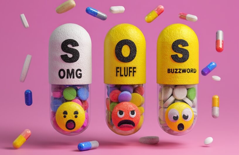
Does your healthcare brand have a bad case of Doctor-Speak Syndrome? If so, don’t panic. This condition is common (just mildly annoying). Symptoms include excessive jargon, acronym overload, and a tendency to sound like you’re writing a peer-reviewed journal article instead of, you know, talking to actual humans.
The cure? A hefty dose of Plain English (or Spanish, French, German…you get the picture) — the kind of language that connects, resonates, and doesn’t make people head to Google after every sentence. Because in healthcare marketing, clarity is power and, ultimately, success.

The jargon epidemic: why clinical jargon sneaks into brand messaging
Somewhere along the way, healthcare brands got the idea that the more complex you sound, the more credible you are. Spoiler alert: it’s not true (and it’s not working).
We know your brand is made up of brilliant minds and groundbreaking science. But if your messaging reads like a clinical trial protocol, you’re not impressing anyone. You’re just exhausting and confusing them.
For instance, “We optimize therapeutic adherence through innovative engagement frameworks” simply means you remind people to take their meds. And, “Our platform offers scalable interoperability across diverse healthcare ecosystems” translates to your system working with others.
See how exhausting that was?
Most people don’t want to decode a medical mystery to figure out how your product helps them. Even HCPs — who are trained in this stuff — would rather not wade through walls of jargon when they’re juggling patients and paperwork.
Plus, every unnecessary technical term is an opportunity for people to tune out, click away, or misunderstand something critical.
Ultimately, jargon makes your audience feel left out. And in an industry where clarity, trust, and human connection win hearts and business, that’s a branding risk you can’t afford.

“Plain English” isn’t dumbing it down — it’s smart branding
Using Plain English means you’re smart enough to explain complex ideas in a way people actually understand. That’s not lowering the bar — that’s improving communication.
The smartest brands in healthcare are the ones who know when to trade in the technical talk for human language. Plain English is your branding power move because:
- It builds trust. People don’t trust what they don’t understand. Clear language shows transparency, honesty, and empathy.
- It makes you more memorable. Simple, vivid messaging sticks. Overcomplicated, buzzword-packed sentences? Not so much.
- It converts. Whether you want a patient to book an appointment or an HCP to request a sample, clarity shortens the path to action.
- Google loves it. SEO isn’t here for your jargon parade. Because Plain English is what people are searching, it wins search rankings and keeps bounce rates low.
Plain English doesn’t simplify your expertise — it amplifies it. If you can explain what you do in a way that makes people feel seen and understood, you’re already ten steps ahead of the competition.

5 simple prescriptions to humanize your brand voice
The good news is that Doctor-Speak Syndrome is 100% treatable. At SFC Group, we’re pros at implementing a few strategic tweaks that will bring your brand voice back to life.

Lead with emotion, not ego
Most people don’t care how advanced your product is if you can’t explain how it improves their life. If your first sentence doesn’t resonate with a real human emotion or need, rewrite it.

Swap buzzwords for benefits
If your copy doesn’t say what’s in it for the reader — cut it. “Advanced data-driven patient solutions” sounds fancy, but it’s empty calories. Tell them what problem you solve, how it helps them, and why it matters.
Embrace the active voice
Passive voice is an impersonal snoozefest. “Therapeutic outcomes are enhanced by our solution” is a great sentence… if you want people to stop reading. Flip it. “We help patients get better results.” (So long as it’s been proven by data and is in the PI, of course.) Active voice = clarity, energy, and a message that moves people.

Use analogies and visual language
Analogies are your best friend when translating complicated ideas into relatable ones. Don’t say “lipid absorption therapy optimization” — say “We help your body soak up healthy fats, like a sponge does with water.” See? Instantly clearer.
Test, learn, and iterate
Test different tones, gather feedback, and monitor how your audience speaks. What lands today might need a refresh next quarter. Flexibility keeps you relevant and keeps jargon from sneaking back in.
Your brand voice called — it wants to be understood
If your audience needs a translator to get through your marketing, you’ve already lost them. In a world drowning in information and short attention spans, clarity isn’t optional — it’s a must.
Plain English makes you relatable, approachable, and memorable. And that’s exactly what turns readers into loyal customers.
So let’s put an end to the jargon game. Your brand voice deserves better. Your audience deserves better. And honestly? You’re way too smart to be hiding behind a wall of buzzwords.
Ready for a brand voice glow-up? The doctor is in. (Spoiler: It’s us.)